
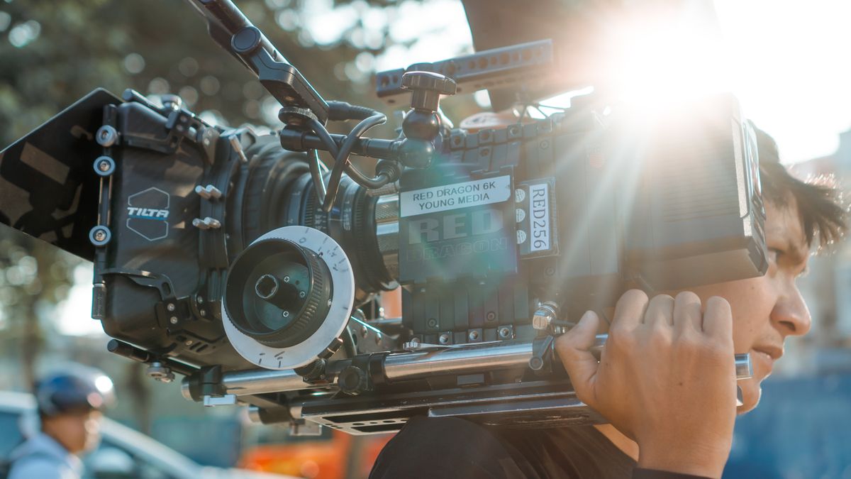
What makes a brand film actually cinematic
It isn't the camera or the budget — it's intent, restraint, and the things you leave out.
Read article → Owen Pratt
5 min read
Owen Pratt
5 min read

Here's a test I do with clients sometimes. I show them two versions of the same shot, ungraded and graded, and I ask what changed. Almost nobody can tell me. They can feel that one version is warmer, more inviting, more finished — but they can't point to a single thing I did. That gap between what we feel and what we can name is exactly where color works. It's a language the whole audience speaks fluently and none of them know they're reading.
Long before anyone made films, color meant something. The amber of late afternoon, the cold blue of dawn, the green of a forest, the gray flatness of an overcast sky — we've spent our entire lives attaching feeling to these without a word of instruction. A colorist isn't inventing a vocabulary. We're borrowing one your nervous system already memorized and using it on purpose.
That's why grading can do what dialogue can't. A line of voiceover has to argue its way into you; a warm push in the highlights just arrives, pre-verbal, instant. Color reaches the feeling before the conscious mind has time to object. Used honestly, it doesn't manipulate so much as set the emotional weather a scene is allowed to live in.
Three controls do most of the emotional work, and a viewer reads all three at once without ever separating them:
None of these is right or wrong on its own. The craft is matching them to the story. I've graded the same product two completely different ways for two different campaigns, because one wanted to feel like a quiet ritual and the other wanted to feel like a Saturday. Same object, opposite films — decided almost entirely in the grade.
The best grade is the one nobody mentions. If a viewer notices the color, I've usually pushed too far. The goal is a feeling, not a filter.
The temptation, especially early in a career, is to grade loudly — crush the blacks, crank the teal, prove you were in the room. It photographs well in a before-and-after. It almost never serves the film. Audiences have grown allergic to the heavy "cinematic" look precisely because it announces itself, and the moment a technique announces itself it stops doing its real job.
So I spend most of a grade taking things away. Matching shots so the cut feels seamless. Holding skin tones honest so faces stay human. Letting the palette breathe instead of forcing every frame into the same orange cast. A grade should feel inevitable, like the film simply looks that way — never like a layer of color was bolted on top after the fact.
The thing colorists wish more people understood is that we can only shape what the camera gave us. A grade refines mood; it doesn't manufacture it. The richest results come when the lighting on set, the production design, and the wardrobe were already building toward the same feeling we'll finish in the suite. Color is the last conversation in a long one — not a rescue at the end.
When all of that lines up, something quiet and powerful happens. The audience never thinks about the color, and that's the point. They just walk away certain the film felt a certain way, fluent in a language they'd swear they never learned. That's the craft: speaking directly to feeling, and leaving no fingerprints behind.
Tell us about your brand and the story you want to tell. We'll bring the camera, the craft, and the point of view.
